Two Flints
It takes two flints to light a fire
Services
The Signal
Craft brewing had a category problem: most brands looked either aggressively industrial or self-consciously artisan. Two Flints believed something different. That a brewer is more than their beer — an artist, a scientist, a drinker and a thinker. The signal was duality. The brand needed to hold both sides without flattening either.
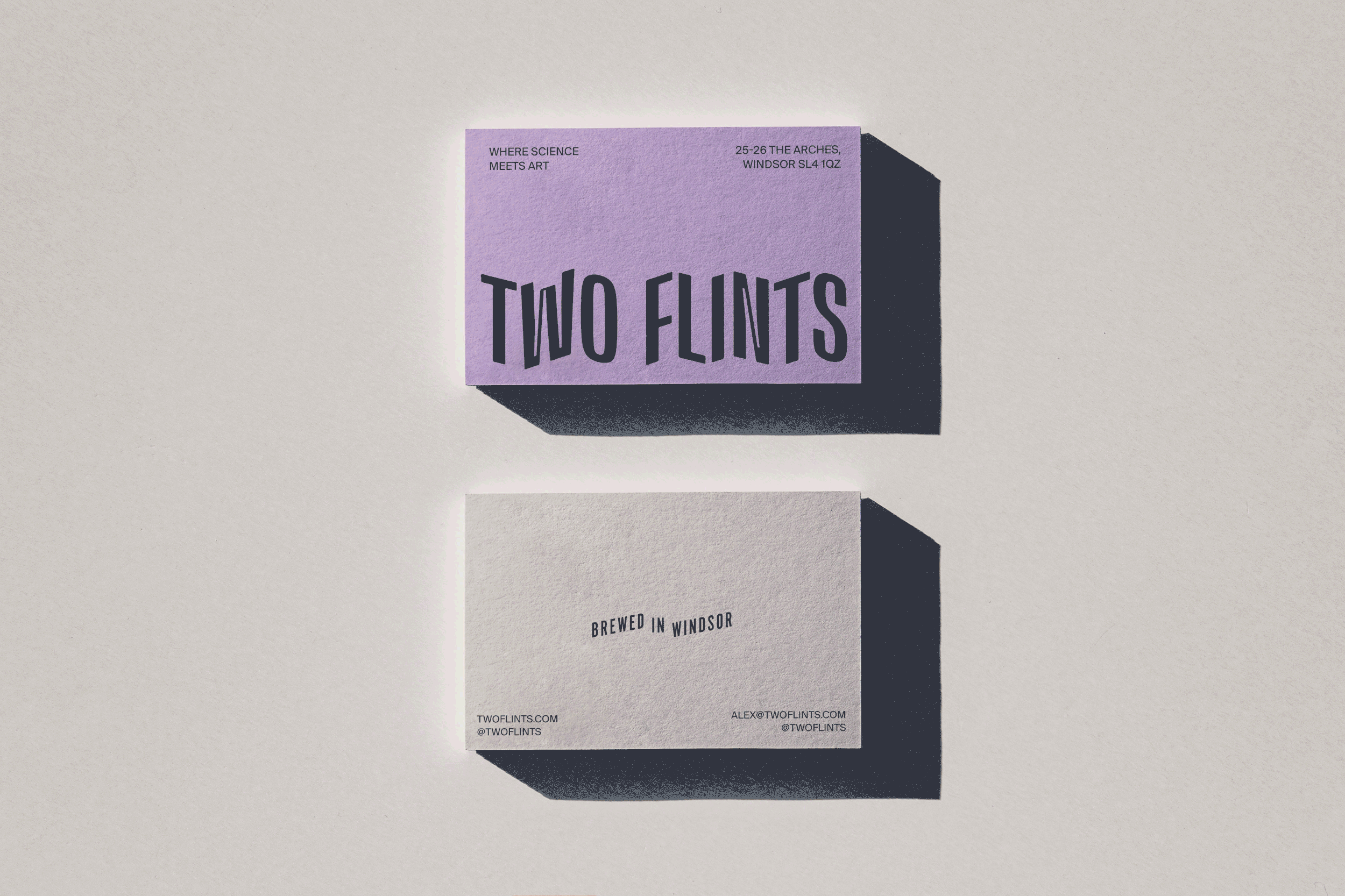
The Story
The name came from Louisa May Alcott: it takes two flints to make a fire. We built the identity around that tension between art and science. A bold logotype with construction marks that felt lifted from a brewer's notebook. A litmus-inspired hop matrix colour system where each beer variety had its own character. The result was playful and rigorous at once — exactly like the product.
The System
A complete brand system spanning packaging, taproom collateral, merchandise, and digital. The hop matrix gave the brand an engine for infinite variation while the core identity stayed coherent. Every touchpoint, from the pint glass to the can to the t-shirt, reads as unmistakably Two Flints.


Next Project
